Skip to content
or type /two way writeups in an existing doc to use the template below.How the writeup starts with clear background and context for the reader.How the writeup is put forth early, well ahead of launch to ensure plenty of time for feedback, follow-ups and partnership with the rest of the teams.How interactivity is strategically placed — ‘mark as read’ buttons placed mid-way through since this was read by a group during a meeting, structured table of concerns that you can add to as a reader/collaborator, structured place for questions with sorting for upvotes, and a pulse check for overall thoughts at the bottom when you’re done reading.
From user testing, there was no observed difference in familiarity - users in the inline toolbar variant labeled Coda as simple or similar to other tools just as often as users in the baseline variant.Consistent with our “right over familiar” value.From user testing, we did not find this to be a concern. Even when users had the toolbar, they still used / commands and Explore far more often to find things.We will watch specific metrics to ensure this doesn’t get affected.We will continue iterating to promote the toolbar in the UI at the appropriate moments (placeholder text, right click menu, / menu etc).Hold down Command key - tell users this reactively and find ways to teach this in the product proactively.Use / commands e.g. /bold, /link, /red, /emoji, /list.We’re adding quick paragraph style switching in the 3-dot menu.We’ll add an option in the right-click menu on a cell/row/column.We have tried to strike a balance but would love feedback to fine-tune the heuristicFind ways to make the toolbar unobstructive - e.g. make it smaller, transparent etc.Add a delay between when you select and the toolbar shows up.
Continue learning: We are still working on many ‘P1’ issues and feedback and refining a lot of the details. As part of that, we would love to collect more feedback internally and so please help us out by adding feedback and . We would also love for the Go-to-Market teams to suggest makers who might have valuable input on this feature, and we plan to run additional user tests for other scenarios like coming into a collaborative doc, published doc, etc. Finally, we are considering doing an opt-in beta ahead of launching this in order to collect more feedback from existing users and ease people into the upcoming change.Ease the transition: On the day we release the inline toolbar, users will need to switch to a slightly different way of doing things. We plan to help them by providing in-product callouts that educate them about the feature as well as holding the Command key to show the toolbar. We would also love to partner with Go-to-Market teams to produce an instructional video we can link to and be ready to provide support as necessary.Tell the story: We plan to write a thoughtful blogpost that shares the “why” of the feature with users, similar to the . This is an important part of being transparent and clear with our makers, as we change a product that they know and love.Monitor data: We want to make sure that this feature does not regress any metrics around discoverability of key features or even activation of new makers. We will build a dashboard to review these metrics so that we can investigate and address any issues we find.
 Polly Rose
 Buck Dubois
 Felix Marlin
 James Booth
 Mary Jones
 Lawrence FitzgeraldUnlocking new scenarios: I’m completely behind the use cases and possibilities this unlocks for the product ー this path makes sense.Personal frustrations as a user: However, I’ve found some of the nuances around the interaction for this feature to be frustrating. At times some interactions have felt jumpy and noisy. I completely trust this team to work through the details, but imagine it might take some iteration.
 Lola Tseudonym


 Example: Inline toolbar
A real Coda product launch example, using two-way writeup.
Copy this page
The writeup below is a real proposal shared internally at Coda for the feature that shipped in April 2021. It’s been slightly edited to remove confidential information and add clarity for non-Coda audiences. The writeup was done by and from our Product and Design team.
As you read, pay attention to:
Background
As Coda transitions toward honing the simple cases, things like the visual design and emotional feeling of the product become more important. In the past, we saw evidence of this with the launch of features like centered content and cover photos, and especially with the . While we knew those features would be impactful ahead of time, we were still pleasantly surprised at the reception from makers and the continued enthusiasm for the dozens of small improvements we’ve done as a follow-up.
Since Coda’s inception, we’ve debated whether the toolbar should be fixed or inline. More recently, the inline toolbar was one of the features that we scoped out of the original visual refresh project. Our guiding principle behind the visual refresh was to minimize Coda UI and make more space for the user content to shine. In the same vein, the top toolbar is a piece of UI that permanently takes up real estate on the screen, even though it is not actually used that often. A majority of people who write and edit docs in a given week don’t use the toolbar. More importantly, the toolbar makes Coda docs feel more cluttered and “work in progress” for viewers and contributors. For that reason, we believe that switching to the inline toolbar will make Coda docs feel more lightweight for simple cases and more presentable for sharing with others.
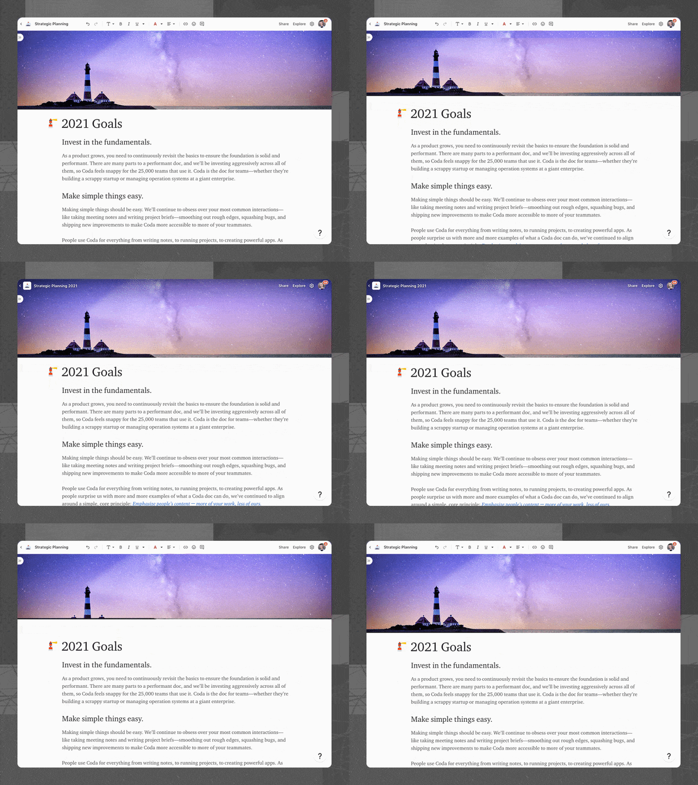

While we have always believed this change is the right direction to go, we had scoped it out in the past because we wanted to make sure to manage the transition well when we do. We decided to make this change now because it also blocks our ability to support key upcoming launches.
Who moved my cheese?
As with many other products, design changes in the UI can be controversial and draw backlash from makers. The inline toolbar is an especially sharp case of this change because it requires some adjustment to a new way of taking key actions. Moreover, there are some small scenarios that may have more friction with the inline toolbar, such as formatting the text on a blank line or in a single cell.
Given these constraints, we want to take a careful and considered approach to designing and launching this feature. Through our internal testing over the last 2+ weeks, we have received a lot of great feedback from Codans who are power users of Coda. We have run many user tests with new users across the baseline and inline toolbar variants. We plan to do additional testing and monitoring, but would love to share out what we have learned so far to collect input.
I’ve read this far 
3
Concerns
Besides the transition, here are the key buckets of concerns that we have heard so far with the inline toolbar, along with our current thinking on how to mitigate them.
Concern
Description
Mitigation
Concern
Description
Mitigation
Familiarity
Coda feels less familiar as a doc surface to those coming from Word, Google Docs as well as existing Coda users.
Discoverability
It might be harder to find how to do specific things like adding a hyperlink, emoji, comment etc before selecting.
Convenience
The toolbar doesn’t always show when I need to use it. I have to select something first e.g. blank line, single cell/column etc.
Noisiness
The toolbar sometimes shows up when I don’t need it, for example if I select text to read or select multiple rows/columns to move.
There are no rows in this table
Motivation
While we are cognizant of the concerns and want to do our best to address them, we believe there are still a number of important reasons to ship the inline toolbar. Here are the key reasons we’ve identified and please add comments to share your thoughts on them:
Reason
Description
Expected impact
Reason
Description
Expected impact
More beautiful & presentable
The lack of an ever-present toolbar means that docs look more ready to share or present, with or without cover photos.
People may be more likely to share Coda docs with their team or publish them to make their ideas shine.
Cleaner & simpler
A majority of weekly active editors never use the toolbar at all, so hiding the toolbar would make Coda feel more lightweight for simple cases.
People may be more likely to use and promote Coda for simpler cases like jotting down notes or a project brief.
Highlight what’s unique
Go from having ~15 buttons at the top of the page to just 5, making key actions like Share and Explore more prominent.
Increase in users clicking Share and Explore, especially Gen 1 users coming into a doc where Explore is not open.
Closer at hand
Since the inline toolbar shows up right next to your selection, it saves time compared to taking your mouse all the way up.
Applying a format using the toolbar takes less time and mouse travel than before.
Available in more surfaces
Users can now see the inline toolbar in places they couldn’t before, including row modal, comments, and also planned new features.
Increase in users applying formatting in row modal & comments, and unblocking future capabilities.
Contextual buttons
Since the toolbar is not always visible, we can show a different set of items based on your selection e.g. folding for headings.
Increase in discoverability of features like folding (and other things in the future like creating a view of a table).
There are no rows in this table
Plan forward
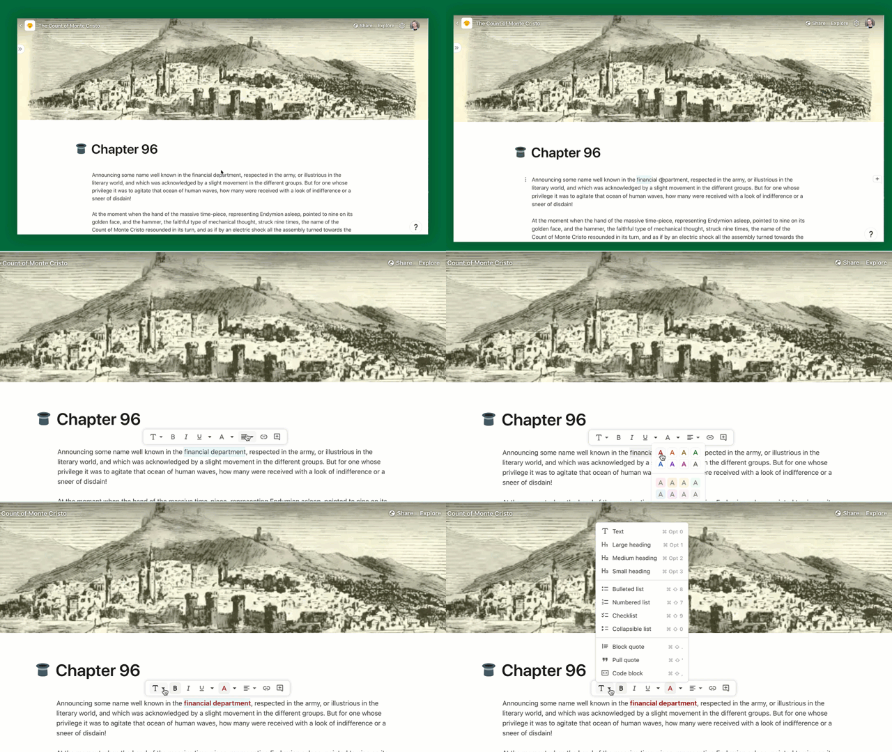

As a story team, we believe this feature does not lend well to running an A/B test because it could cause maker content to look different for different collaborators. And, running an A/B test also makes it harder for us to effectively tell the story of this launch and ensure that our essential help articles are up to date. We also believe that there are longer term benefits to making this change (outlined at the top), and are comfortable launching if we do not regress metrics we’ll outline in another writeup and dashboard. However, we are still open to revisiting this decision and would love your input on this.
I’ve read this far 
4
How do you feel about this plan?
Add your sentiment
Toggle to show everyone's pulse check (submitted. Avg of out of 5)
7
4.29
Pulse Check
Reflection
Submitted by
Pulse Check
Reflection
Submitted by
Ship it! It’s a huge improvement and I think will really benefit power users and new makers alike. My only concern is it sometimes shows up when I don’t want it, but I think we’re balancing that fairly well on the whole.

Really enjoying this feature overall! It’s made room for some delightful visual updates like transparency over cover photos. 👏 Discoverability of certain features is the main concern I’ve had and where I imagine some roadblocks for users.

I’m generally bullish on this feature, and I think docs look much cleaner. Although I reacted viscerally at launch, over time I haven’t found myself missing it at all. I actually don’t think it shows up when I don’t want it, and when it does it disappears very quickly.
I’d also like to find a way to do a clean in-app modal (not a large one that takes over the screen, not an intercom in-app, but one that sits in the bottom right corner of the screen and educates users at launch on a few key things to keep in mind.

I feel good about this change overall. The main question I have is around how do we mitigate the pain around moving the cheese. There was an initial shock for me, but I very quickly came around. So I feel we just need to figure out how to manage the migration.

Great summary, research and plan. I’m very excited about the impact this feature will have, and think it will be greater than we expect, similar to the visual refresh.
As with any visual change, makers will need to adjust and there will be some who don’t like it ー that’s ok, expected, and we’ve all been there with other tools. The details of communicating & rolling out the launch will be important.

I’m very bullish on this feature and feel it gives us a better first impression. Sometimes users have a hard time articulating a change like because it just ‘feels better’.
I also think the 10 commands on the toolbar may have been limiting as a first impression. Instead of feeling like a familiar doc surface I think we may have come across as a more limited text editor since word and docs have a much more complex toolbar.


There are no rows in this table
Dory: questions & discussion topics
Add and upvote questions or discussion topics below.
Add a topic
Idea
Author
Upvote
Downvote
Idea
Author
Upvote
Downvote
Since there were some dependencies on the Go-to-Market team, can you speak to the timing of your next phase of testing and eventual launch?

9
Re: experimentation ー I’m confused by the wording, I understand that we’re aiming to understand impact through other methods, so is there a need for an experiment writeup?

8
2
Thoughts on setting up a few one-liner canned responses to the potential “who moved my cheese” questions? Even if we don’t use them, it’s worth the exercise.

6
Is it worth setting up a form/doc/community post/something else where users can submit anonymous feedback? (post-beta)

4
1
There are no rows in this table
Want to print your doc?
This is not the way.
This is not the way.
Try clicking the ··· in the right corner or using a keyboard shortcut (
CtrlP
) instead.