Skip to content

Who actually read the writeup? → “Done Reading” reactions. The approver didn’t leave a comment. Did they not read it, or not care, or disagree with the plan? I’m sure you’ve all done some “avatar-watching” in a Google Doc to try to see who actually read it. Yuck. Coda adopters add a one Reading reaction with instructions to click when you’re through reading. Much simpler.Try it!
Thousands of comments, but which ones are important? → Dory topic voting. In the sea of comments in the right-hand pane of your Google Doc, you work your way through them one by one. The first one is a grammatical comment, next is a clarification question, then more grammar, and then, bam, a super-important comment, and so on. For many teams, this process feels impossible. Which of these comments actually matter? Teams that run on Coda add a discussion topic-voting table to the bottom of the doc (we affectionately call these “Dory,” named after the fish from Finding Nemo who asks all the questions). Reviewers are free to add comments throughout the doc, but those are used for clarifications and suggestions. If you want a topic to be actually discussed and addressed, you have to add it to the Dory topic-voting table.Try it!


 Where do the decision-makers actually stand? → Pulse sentiment feedback. Comments can be quite passive-aggressive. A comment such as “Are we sure customers will like this approach?” can be interpreted as a genuine ask for clarification or a sign that the approver is not aligned. If you’re trying to drive a decision, how do you know the difference? Maybe you interpret other signals: the comment was made on the title of the doc, perhaps that means it’s more important? All of this slows down your team and prevents good decisions. Most Coda adopters skip the ambiguity and just ask the reviewers to write where they stand. We generally call this “Pulse,” a table where each reviewer has a row where they score where they stand (often on a 1 to 5 scale) and write down their reasoning. As a bonus, to reduce groupthink, you can hide everyone’s Pulse until everyone else is done adding their own.Try it!


10x more decisions: We make 10x more decisions per week... by eliminating standing attendees.10x faster decisions: Each decision is made 10x faster... with structured decision-making.10x easier decisions: With a decision-making process... that runs itself on autopilot.
Does Dory/Pulse lead to an overly “democratic” system? Is it always “do what the majority says”?Should each writeup live in a distinct doc or inside other docs?What’s the easiest way to test a Decision Doc with my team?What if I have a slide-deck culture?Can I do something similar in a Google Doc? Approximating Dory: The core of this technique is voting on topics and going through them in order, taking notes along the way. A few approaches:Use Google Docs tables (without sorting, inline note taking, or AI summaries): Google Docs added inline reactions so you can vote on individual lines like this:Switch to Google Sheets (with column per person): If you want the sorting, you could switch to a Google Sheet for topics and add a column per person for voting. I had a friend build an example that you can copy Approximating Pulse: Two approaches I’ve seen:Use Google Docs inline tables (and live with group think issue): Some teams use a Google Docs inline table to gather sentiment like this:Switch to Google Forms (avoids group think buts add friction): But if what you really want is the “avoid groupthink” aspect of Pulse, then most teams switch over to Google Forms for this. It’s pretty heavyweight (having to set up the form, design the questions, etc.), but it does work. You would just design a form that looks something like this:
Approximating a Decision Forum like Coda Catalyst: Two thoughts on how I would approach:Give up on the “no standing attendees in your decision forum”: This is obviously the core of the 10x Decision Forum model but, if you removed that concept, then you could have a single meeting with a topic list in Google Docs or Google Sheets. There’s a bunch of other helpful patterns in the Catalyst template that are difficult to replicate as well (auto-sending pre-read notifications, etc).Assign or hire a person: If you want to fully follow the “no standing attendees” model, and deploying Coda isn’t possible, the most practical (albeit expensive) option is generally to assign the back-office tasks to a single person. Be forewarned that it can become nearly a full-time job.
Share
Explore

 2. Decision Docs
Transform your product team’s decision-making.
One thing I talk about a lot with other leaders is how decisions get done. I wrote a post called about how our tools influence decision-making and it’s the most popular post I’ve ever written. I regularly get feedback on how teams deployed the methods in two-way writeups to supercharge decision-making at their companies, and I’ve been collecting the stories and the templates that come back. The inspiration is almost always the same. As one founder told me:
“It felt like the most important decisions in our company were jammed into the 100-pixel panel hanging off the side of our Google Docs. Is that really the best we can do?”
But they followed up with:
“Google Docs taught us all how to sit on the same typewriter. Coda moved our team from co-editing to co-decisioning.”
I’ve come to label this set of patterns as “Decision Docs,” and I’ve now seen hundreds of teams develop Decision Doc templates in Coda. Each template describes not only how decision memos should be framed, but are constructed to carefully drive a decision-making process that matches the team’s culture, and this results in real conclusions. They often have iconic names and cultural indicators. Zoom chose
(Root Cause Reasoning), Square chose ., Amazon’s is , Nextdoor chose S.P.I.C.E., etc. Here’s an example of a typical “two-way writeup” from our team at Coda: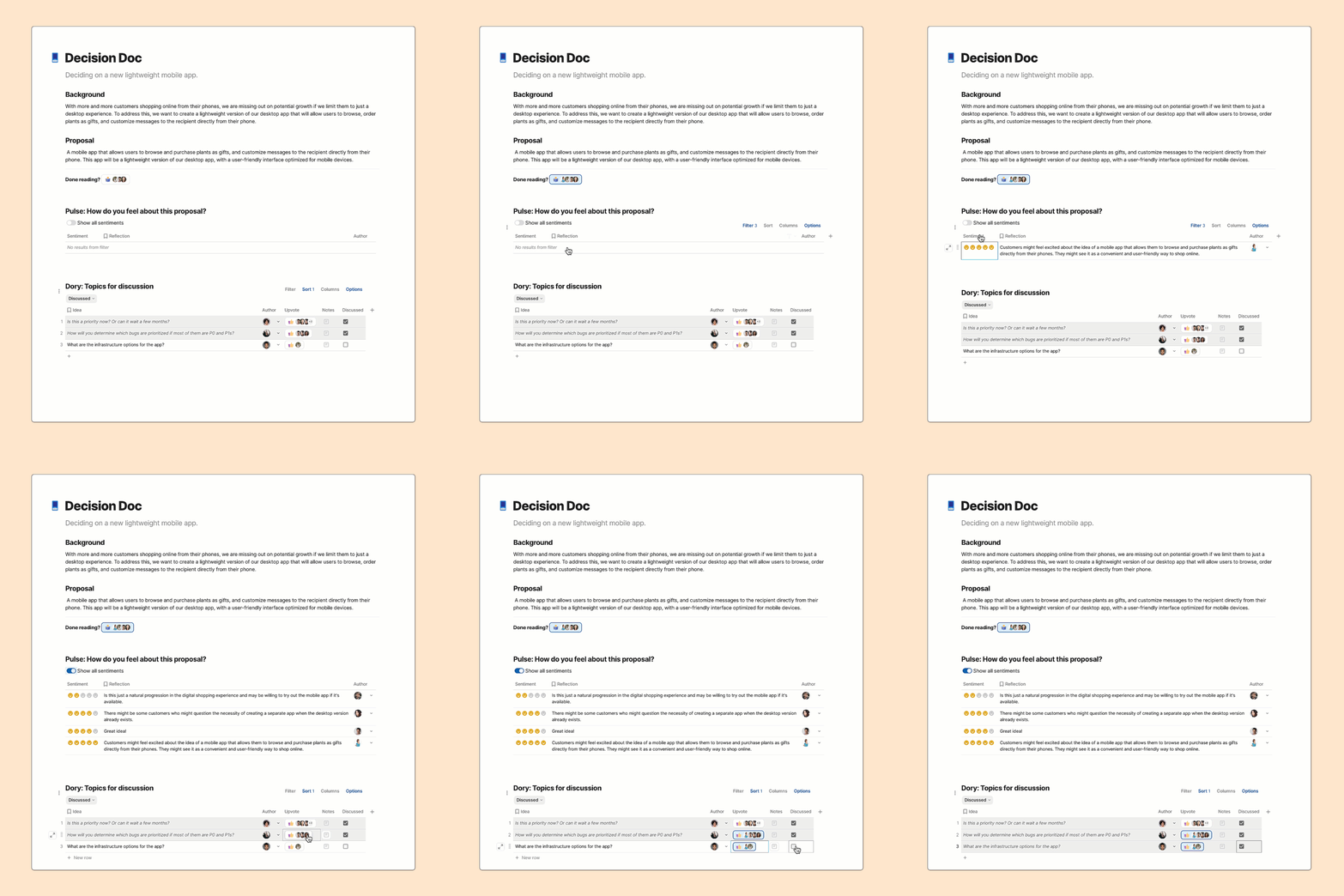

A Decision Doc including structured feedback (without groupthink) and topic voting.
Want to jump ahead?
Why the best product teams choose Coda for Decision Docs.
Our data team at Coda did some research and found that over a million Decision Docs have been created in Coda. That statistic really jumped out at me and so I set out to learn more by interviewing teams that have deployed these techniques. Through these discussions, I learned a number of insights and tricks on why they chose Coda for this ritual, and how they got it to stick. Here are the top reasons:
1. Writeups for actual decisions. Don’t make big decisions in the comments.
Here’s a comic we created for my post on to explain the evolution of decision-making:


We’ve come a long way from the days of mind-numbing presentations with no opportunity for feedback. In the early 2000s, Google Docs brought us collaborative co-editing (an amazing step forward), and many teams quickly switched to a “write a memo and ask for comments” model for decision-making. It’s definitely better, but now it feels like passing around a printed memo and asking everyone to add sticky notes. Coda adopters have generally found a better way, which leverages the fact that Coda is not just a collaborative surface, it’s an interactive one as well. These teams typically highlight three problems with the Google Docs approach that they’ve fixed with Coda:
Done reading? → 
Dory topic voting
Upvote
Topic
Author
3
What’s the deadline?

1
Can we cut feature X and launch today?

Can we add feature Y and launch next week?

There are no rows in this table
Show all sentiments
Sentiment
Reflection
Author
Search
Author
Sentiment
Reflection

I feel great about the proposal!

I worry about how this will affect the mobile experience.

Cautiously optimistic!
There are no rows in this table
While there are many reasons why teams keep selecting Coda for Decision Docs, I think this is the most significant one. They see that they are making decisions in a river of thousands of Google Doc comments and realize it isn’t working. Coda gives them an interactive surface that gives teams a way to construct a deliberate decision-making process.
2. A living writeup with the latest data—no need to copy/paste over and over.
We’ve all been there—you’re ready to send an important writeup for a critical product review but the meeting gets moved and now everything is out of date. So you have to stop whatever you’re doing to copy-paste new results, the updated designs, additional screenshots, etc. Oh, and customer feedback just came in, so you have to chase that down again to make sure that’s included. It’s after midnight and you finally send out the updated pre-read.
You login the next day to see that the meeting has been pushed out another day.
And the cycle continues.
One product leader at a well-known fintech company told me that the typical PM spends 50% of their time doing the “tedious work about work.” Chase down updates, copy/paste between dozens of apps and hundreds of docs. But when they shifted to Coda, all that disappeared.
Because all of Coda’s building blocks—including tables and pages—are connected, writeups built on Coda are infused with information that updates in real time. It’s easy to embed anything, so we see product teams embed live versions of designs and metrics dashboards all the time. Coda also has Packs that integrate with over 600 different applications, so the team can sync in the latest from Jira, latest customer feedback, and any other must-have tools.
Here’s an example of what a data-infused writeup looks like (from one of our all-star user researchers at Coda):


Coda’s UX Research team creates writeups that are always interactive, actionable, and synced to live data.
3. Kill the meeting! Async decision-making!
Does every decision require a meeting? I’ve found that the teams that have the fastest decision-making figure out how to do it without having the meeting at all.
“So we created a , along with a centralized repository for decisions made at the company. The results speak for themselves: 90% of decisions now get made asynchronously, and we easily gain clear commitment from stakeholders.”
It turns out that many of our advanced Coda adopters take Decision Docs to another level and actually kill the decision-making meeting altogether. Here’s the typical pattern:
This pattern generally spreads like wildfire through a company. The ability to cancel meetings and shift to async decision-making is very compelling.
4. A powerful AI assistant to not just help write, but to drive the decision.
Like most of the world, Coda customers love exploring the possibilities AI brings to improving how teams operate. As background, Coda AI now supports a number of different modalities. You can check it out at .
For Decision Docs, the obvious way to use Coda AI is in the writing phase, where it acts as a writing assistant that forms a list of ideas, adds and augments writing, and refines writeups to ensure clarity. One of my favorite ways to use Coda AI as a writing assistant is to ask it to proofread my work like this:
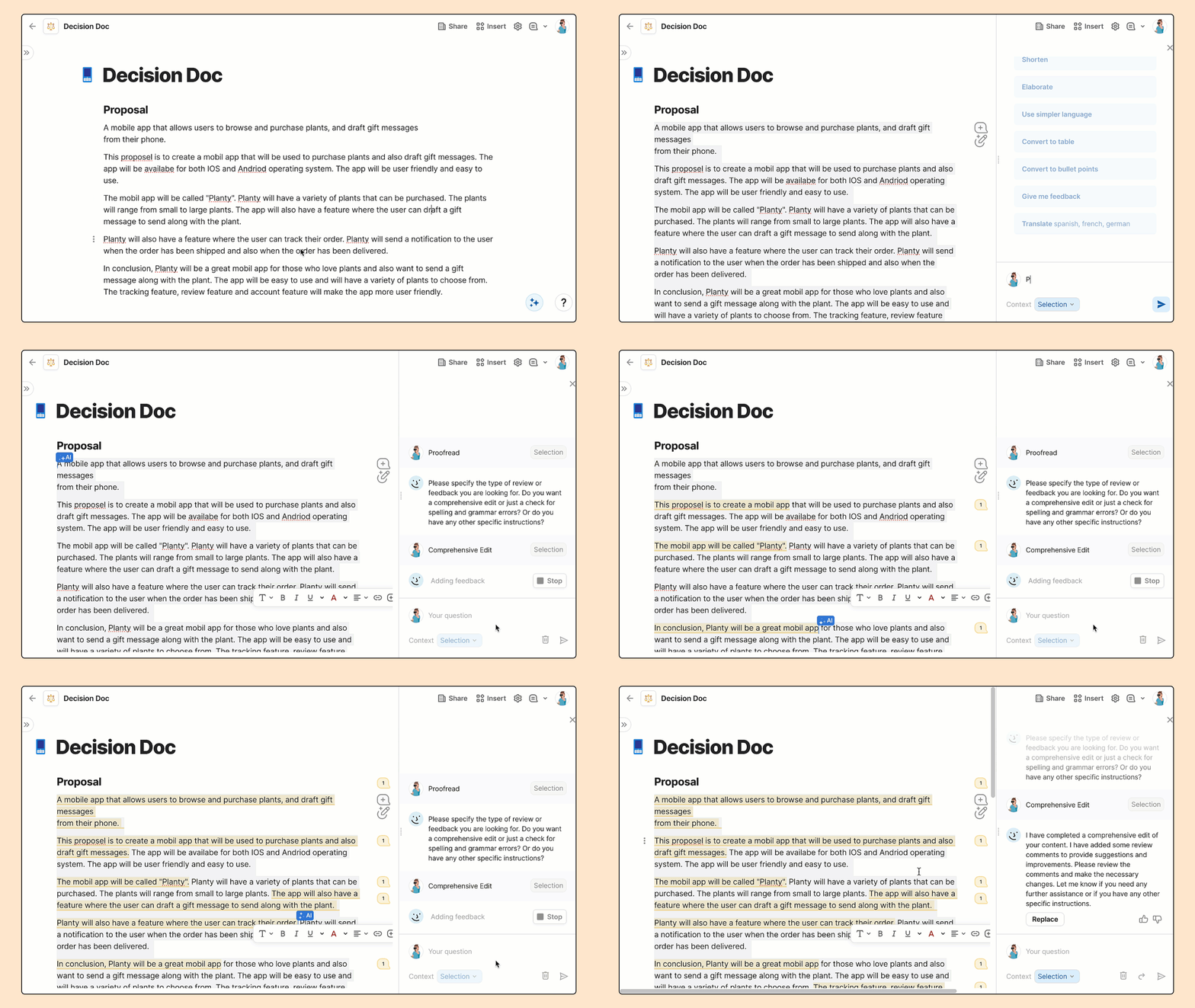

But the most magical thing I’ve seen Coda advocates do is use Coda AI in the actual decision-making process. One fun example I saw was one of our customers that loves the Dory/Pulse model of structured feedback collection, but found that consuming, and interpreting all the feedback submitted was time consuming.
So they added an AI block that simply summarizes the Pulse table and gives a quick version of where everyone stands. Here’s an example:
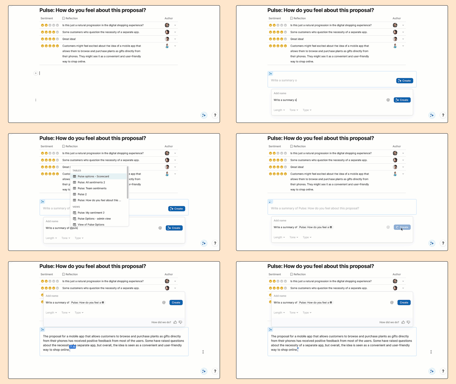

5. It’s an easy transition from Google Docs, with new bells and whistles.
Shifting to Coda can improve your team’s decision-making ritual—structuring your decision process, removing copy/paste, perhaps even shifting to async.
But there’s an elephant in the room: everyone already knows how to use Google Docs—is it worth the change?
Often, when teams roll out Coda, the sponsor of the deployment will write a note to the team describing Coda. I caught this line in one such note in a Fortune 1000 company deploying Coda:
“We’re shifting to Coda for our decision memos! You can see a template at [link]. It’s a bit of a change from our current Google Docs model. But don’t worry, Coda is everything you love about Google Docs, but with a few new (important) bells and whistles.”
The fact that they included this last line was very interesting to me, so I reached out to learn more about what they meant. What I learned was that they had tried to shift to Coda a while back, but had stalled when the team asked about some of their favorite Google Doc features. It seems that they did an evaluation and Coda was missing one critical feature—a “suggest changes” mode. When we , they decided to take another look. As a part of that, they shared their evaluation with us. Here it is:


There’s clearly still a difference. Google Docs continues to be a type-setter’s dream—Coda lacks the formatting and layout flexibility that you would need, for example, if you were writing a printable book. But for modern teams making collaborative decisions, teams tell us that Coda has covered the primary set of features well—especially reviewing and commenting. And generally they call out that features like interactive buttons and reactions, collapsible regions, left-hand page navigation, and embeds/integrations are very important additions.
As this team summarized:
“I’m done with infinite scroll Google Docs that are 60 pages long. Drop it into Coda and structure the left nav into sensible pages, use collapsible headers to hide away detail, and use callouts to drive attention to key points. Finally, a writeup that your readers will actually read.”
Simple rule: if you’re writing a novel, use Google Docs. But if you need to make a decision, use Coda.
How to get started with Coda Decision Docs.
As I’ve watched teams adopt Decision Docs, I’ve noticed that it typically happens from the bottom-up. First an individual PM discovers the magic of Coda in accelerating one important decision. Then the organization decides to templatize this experience into a set of Decision Doc templates for the team. And finally, many of the teams create a standing Decision Forum.
I’ll walk through some examples of this below, but the end result turns out to be very important—how you make decisions is one of the key hallmarks of your culture. It’s no surprise that many companies give their decision rituals a catchy name (, ,
, etc.), after all great decision-making isn’t just a key element of your execution velocity, it’s a cultural investment as well.1. Try: make a single decision with a decision doc.
Let’s start super-simple and just make one good decision.
Pick an upcoming decision. Write it or copy/paste your writeup into a Coda doc. Add an interactive decision template by typing /dory and pulse.
A quick visual of those steps:
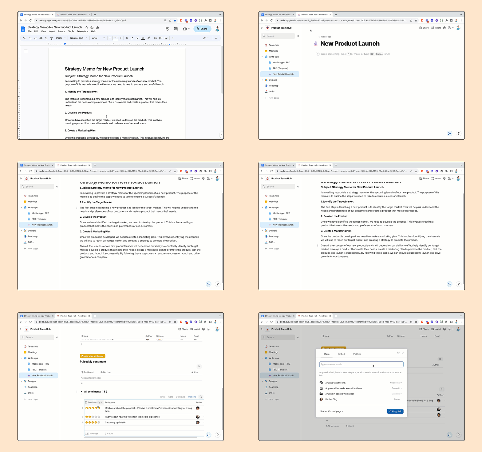

Here’s a blank example you can start with: . Once you start using Coda Decision Docs, you’ll never want to go back to a static, non-interactive writeup again!
2. Customize: build your own decision templates for PRDs, briefs, retros, etc.
Hopefully at this point, you’ve run one (or more) decisions through Coda and seen the impact of an interactive, living, structured writeup. But to make the ritual stick, it’s very important to templatize it in a way that matches your unique culture.
Here are the steps to start with a base Coda Decision Doc template, make your modifications, and publish it as a in your workspace. You could also borrow ideas from the dozens of great Decision Doc templates that have already been published in the Coda Gallery—and I’ve outlined a few of my favorites with a bit of what I like on each one:
2a. Start with a base template and customize it.
You should adjust it to your process and, when it’s ready, you can publish it as a to your workspace.
2b. Form your “proposal” structure like Figma, Zoom, Amazon, Product School.
Before we get to the decision-making phase of a proposal, we need to capture the proposal itself. Many companies have unique approaches to how to structure the central “body” of their writeup. You can look through some of my favorite examples and borrow the patterns that work for you:
2c. Choose the best feedback model with ideas from Dory/Pulse, YouTube, Luxury Presence, and Gamestorming.
The heart of your Decision Doc template is the feedback process: how can you make sure to hear the right input from key stakeholders in a way that is understandable, actionable, and not biased. A few of my favorite patterns:
Another great resource: Shishir put together a catalog of 14 distinct ways teams have adapted their feedback models in his article on .
2d. Structure Roles and Responsibilities like Gokul’s S.P.A.D.E, Nathan’s Proactive Stakeholders.
Structuring a clear proposal and getting clear feedback is very important, but at some point, a decision needs to be made. Many Decision Doc rituals focus in on clear identification of roles and responsibilities. Some of my favorite examples are:
Once you’ve got a template for how to make each decision, you can move on to a scalable process for all decisions in the next step...
3. Scale: complete your decision ritual with a decision forum.
Many companies have a distinct Decision Forum, sometimes multiple. They come with many names like Product Reviews, Design Crit, Decision Forum, etc., and at Coda we call it Catalyst.
While I’ve seen many forums across companies, in this case, I think that the way we do this with Coda’s Catalyst is a better way. Or as David Kossnick put it in on this topic, the Coda Catalyst way is “10x better.” David outlined three key reasons why:
As you reinvent your decision-making system, I highly recommend adopting a process similar to Coda Catalyst. Here’s a template and a quick graphic of how it works:


A caution: it can be tempting to let your decision forum slip into a single-threaded meeting with standing attendees. Fight this urge, as it creates a cascade of perverse side effects. Instead, keep your decision forums multi-threaded. Read Shishir’s post on for practical advice on how to do that.
FAQ
At it’s core, Dory/Pulse should not be used in a “democratic” way, but I’ve seen decision-drivers confuse this. They’ll ask for everyone’s pulse, and then just take the average response.
I consider this to be incorrect and we actively train our PMs not to do this. It’s their job to make the decision. The goal of Dory/Pulse is to make sure they get unbiased input. It should feel totally fine to say “looks like 4 out of 10 us prefer a different approach. I’ve read your input, thank you for that. I’ve decided to proceed with the proposal, but will keep your feedback in mind.”
We’ve built a few variations of Dory/Pulse to try to encourage this behavior. (More to come soon!)
Most teams using Coda end up organizing most of their writeups inside their . It’s a natural place as it’s where the team already lives and often contains data and references that are included in the writeup.
That said, creating a new doc for each writeup is totally fine too. Pro tip: Type coda.new into your browser to quickly get a fresh new doc.
I would just run a single decision in Coda: Just give your team a taste of what more structured feedback feels like. You can follow the steps , or start with this template: .
“Are we a doc culture or a slide culture?” is a debate I’ve heard over and over again. The camps are always split. There are famous stories of how companies like Nike and IBM went back and forth between “doc culture” and “slide culture”—it’s a very tricky choice!
I’ll admit, I prefer doc culture. But many Coda customers are slide culture.
Don’t worry, there’s an easy solution: Embed the slide deck in Coda. Add Dory/Pulse underneath. Decide.
Short answer: Sort of 😄
As you can tell from the , there’s a pretty long list of differences, and I would recommend following this process in Coda. It’s a scenario we intentionally designed for, so you’ll find the experiences more fluid in Coda.
But if you can’t or won’t, here’s what I would do:


You’ll feel a few gaps here.
Each row must be carefully constructed to have the right reactions and select lists, row by row.
There’s no way to sort the topics. Best practice is probably to ask everyone to add topics at the bottom of the doc, do a round of reactions, and then have someone manually move the lines to be in the right order.
When you take notes, there’s no equivalent of Coda canvas columns so you’ll end up taking notes elsewhere instead of inline with each topic.
And then if you want an AI summary at the end, you’ll have to paste all the notes into your favorite AI tool.
:

Again, you’ll feel a number of gaps.
You’ll notice that the formulas are pretty fragile so you have to be cautious when adding topics and people.
The columns model only really scales for very small groups (can’t do 100 people that way).
You can’t do this inline in your writeup so it requires going to a different tool, and you’ll probably end up taking notes back in the writeup which will bifurcate further.


It’s not possible to “avoid groupthink” by hiding other people’s feedback. So you’ll need to coach your team to add their own feedback before reading others.
Also extracting summaries is hard—either quantitatively (average sentiment) or qualitatively (AI summary of the Pulse sentiments).


Check out for a compilation of all the templates and external links mentioned above.
Want to print your doc?
This is not the way.
This is not the way.
Try clicking the ··· in the right corner or using a keyboard shortcut (
CtrlP
) instead.