Skip to content
%0AYou%20can%20find%20this%20option%20under%20+%20%3E%20Chart%20%3E%20Word%20Cloud.%0AWhen%20configuring%20your%20word%20cloud,%20you%20have%20control%20over%20which%20data%20sets%20(columns)%20contribute%20text%20for%20analysis%20and%20visualization.%20If%20you%20want,%20you%20can%20also%20exclude%20a%20set%20of%20common%20English%20Language%20words%20and/or%20indicate%20your%20own%20set%20of%20words%20for%20exclusion.%0AWe%20look%20forward%20to%20hearing%20about%20how%20you%20use%20this%20feature,%20so%20please%20feel%20free%20to%20share%20your%20feedback%20in%20the%20comments%20below!%0AJason%20&rotation=10&removeStopwords=true)




 QuickChart Pack
Create highly customizable image charts from your Coda data with this simple Pack.
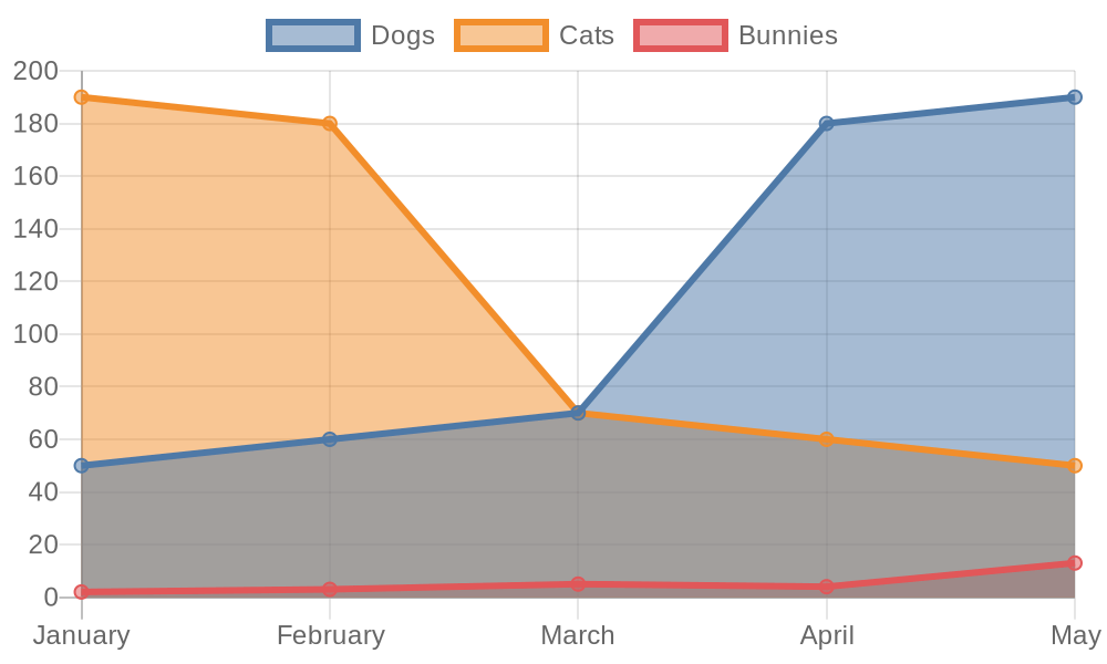
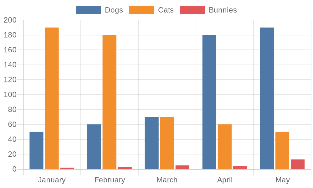
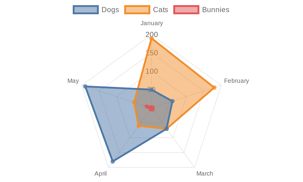
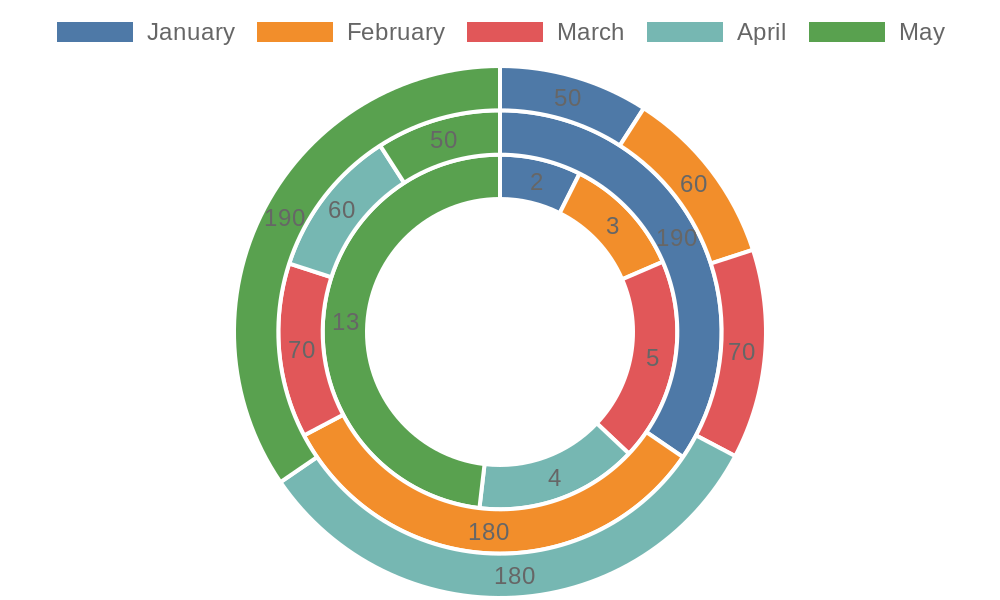
This pack uses to create charts as images. You can create highly customizable WorldClouds, QR Codes, or a range of customizable charts. Just pass Coda table data to a formula and it returns an image of the corresponding chart. If you send a page as an email or to Slack or other services, these charts should flow through to those platforms as they are just images.
or see a more detailed example with .
Copy this template
Word Cloud
Text
Quick Chart
Text
Quick Chart
At Coda, we’re obsessed with data, and we use a number of visualizations to help us understand things like how our community uses new features and how new customers find us. More often than not, we’re viewing charts based on numerical values, but what happens when the data isn’t a raw set of integers, but text-based feedback from our users?
Starting today, you can use Word Clouds as a Chart Type to visualize your data tables, and to understand the frequency of words within your selected data set:
Word clouds are great for writers to understand if they’re “overusing” certain words, and for teams to find key themes in their sentiment tracking or feedback analysis workflows. While testing this feature, one of our own product teams was able to dig into key feedback themes from user research on a totally different product improvement we’re testing (stay tuned!)
You can find this option under + > Chart > Word Cloud.
When configuring your word cloud, you have control over which data sets (columns) contribute text for analysis and visualization. If you want, you can also exclude a set of common English Language words and/or indicate your own set of words for exclusion.
We look forward to hearing about how you use this feature, so please feel free to share your feedback in the comments below!
Jason
There are no rows in this table
Customizable Charts
Type
URL
Type
URL
line
bar
radar
doughnut
pie
polarArea
violin
horizontalViolin
sparkline
radialGauge
There are no rows in this table
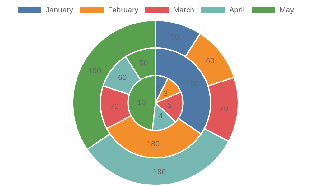
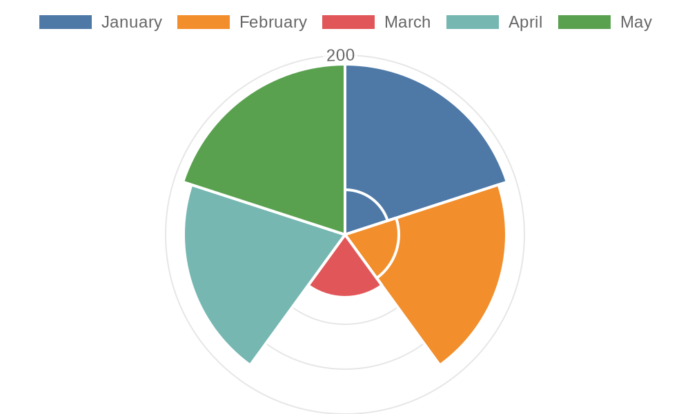
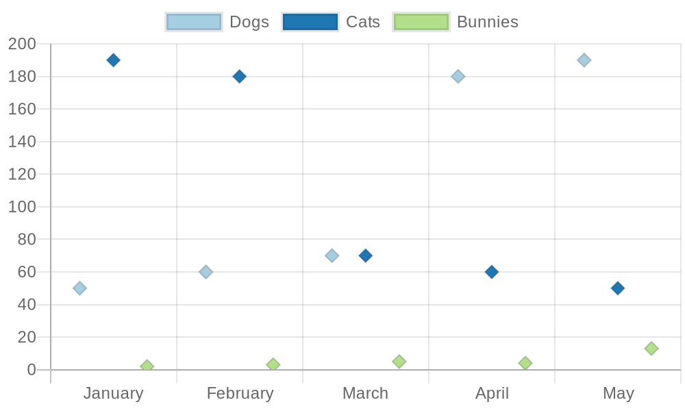
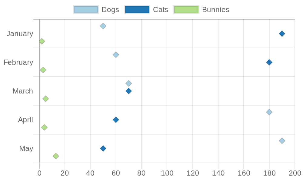
Chart Data
Month
Dogs
Cats
Bunnies
Month
Dogs
Cats
Bunnies
January
50
190
2
February
60
180
3
March
70
70
5
April
180
60
4
May
190
50
13
There are no rows in this table
Family tree
First name
Last name
Children
First name
Last name
Children
George
Washington
Augustine
Washington
George, Samuel, John, Charles, Betty, Mildred
Mary
Washington
George, Samuel, John, Charles, Betty, Mildred
Samuel
Washington
John
Washington
Charles
Washington
Betty
Lewis
Mildred
Washington
There are no rows in this table

Have a more advanced use case in mind? Check out .
Want to print your doc?
This is not the way.
This is not the way.
Try clicking the ··· in the right corner or using a keyboard shortcut (
CtrlP
) instead.
